Poste Italiane constitutes the largest integrated, omnichannel service platform in Italy, covering sectors ranging from logistics, letter and parcel delivery, financial and insurance services, payment systems, telecommunications and energy. Source
This project first started as a simple restyling of the app. But as I needed more from their services, I discovered that there was more than UI tweaks to be done.Talking with users confirmed what the experience has been for everyone - frustrating and difficult to understand.
In order to get the full Poste Italiane experience, users need to install 4 different apps that serve different purposes.The user journey then starts with discovering what all these apps do.


Doing secondary research and confronting other Poste users has been a confirmation of what my personal experience as a user myself has been like - quite difficult.
Recently, the company decided to revamp their whole experience and develop a “super-app” to rule them all, by replacing the old “Ufficio Postale” app with “Poste Italiane”.
Why are all the legacy apps still available?
Did they really get everything in one place?
How did they perform UX-wise?
Discovering legacy apps, their purpose and features.
Discovering the new Poste Italiane app and finding missing features.
Discovering the poste.it website, where all features can be found.
During this phase, I acknowledged the apps I didn’t use that much, and what features they offered.
The new app doesn't support PosteID authorizations, so at least 2 apps needs to be installed.
The new app is missing worldwide transfers through Western Union, present in the Postepay app.
The new app doesn't offer expenses categorization and comparison between months, like in the BancoPosta app.
Poste services are only offered in italian.
PosteID management, so at least 2 apps need to be installed.
Worldwide money transfers through Western Union like in the PostePay app.
Expenses categorization and monthly overview like in the BancoPosta app.
No other languages other than Italian.
Poste Italiane wants to make their app “Italians’ favorite wallet” - it will include transit passes, IDs, fidelity cards and much more.
But the Italian government is already working on a digital wallet and services like Google Wallet or Apple Wallet have better support for cards and transit passes. Moreover, the app is currently not authorized for NFC payments.
MyPoste also plays a fundamental role in the app, as it's supposed to be tailored to each user's needings and used services. However...
The page eatures a quick actions ("Operazioni veloci") section at the top, but it's not customisable - it assumes all the users use the app the same way.
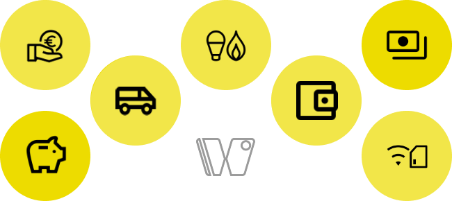
There is a grid featuring links to all Poste services, like insurance, electricity and gas - what if the user doesn't use all of them?
The app offers fingerprint and FaceID authentication. To access the home page, users need to go through a "login page" in which they need to manually tap the "Accedi" (login) button, and then authenticate.
The page offers some quick links, but the user still needs to do the authentication.
This page feels redundant, and an immediate login request can speed up the login process.
The overall design language feels old and not curated. Inconsistent paddings are all over the place and iconography uses different styles and stroke widths.
e.g. My favorite post office is under the section "Le tue attività" (Your activities, literally). What does it mean?
Even more, tapping the "X" icon on the card doesn’t dismiss the card as expected but removes the post office from the favorites list.
Understanding how services and features work.
Eventually simplify user flows.
Putting things together through an AI focused on discoverability.
As the largest company in Italy, Poste Italiane serves a user base that ranges from teenagers, more tech savvy but not fond of banking terms, to seniors, who mostly are out of touch with technology. From my personal experience, a lot of people tend to go to post office to make operations that can be done from the app.
The biggest challenge of the whole project was to understand the services: the purpose they served, who they’re made for, and how they worked “under the hood”, in order to make conscious improvements.
Inside the Poste Italiane apps, users can choose up to 6 ways to transfer their money.
Every service has it’s purpose, limitations and commissions, but the user has to figure out what option has to choose.
Different banks, different holders.
Also between countries adopting the SEPA circuit.
Different bank but the holder can be the same.
Same bank, the two cards can also have the same holder.
A Giroconto betwen two BancoPosta cards.
Instant transfer of small amount of money between two Postepay cards.
Worldwide transfer with Western Union, or Moneygram through post offices.
Making these service more discoverable also improves the whole user experience; the process for each option is also more streamlined.
At the same time, how these services work under the hood, their limitations and commissions are the same - it’s not about reinventing the wheel.

Several Poste Italiane features work through scanning a QR code. In particular:
Cardless withdrawal: scan a QR code in the ATM to withdraw money without a card.
PosteID: scan QR codes shown in the login page of the services to authorize the login from the phone.
Payments: some bulletins have a built-in barcode that imports pre-compiled fields into the app.
Pay with Postepay: some shops are affiliated with Poste Italiane in order to let users pay via a QR code.

The app already has a built in “Scan QR code” option. Considering the generic label, one would think it’s a universal option for all QR codes.
However, when a specific code is scanned and it’s unsupported, it returns an error, and it doesn't give clues about what to do next.
An universal scanner could give users an option they can rely on for all services requiring scanning a code.
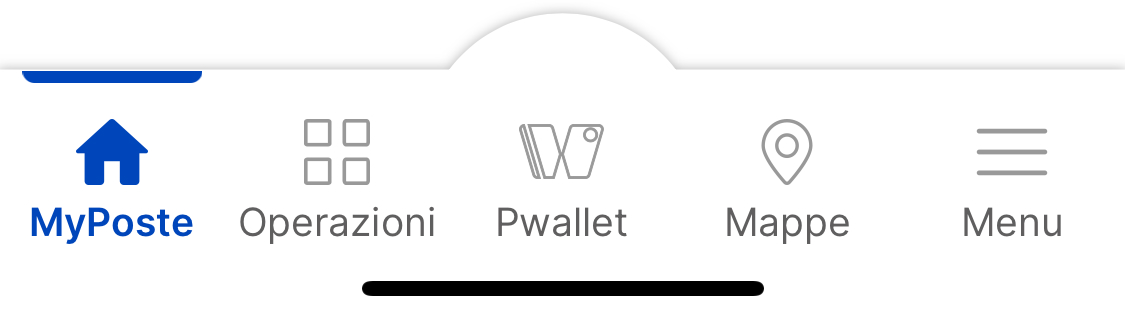
The current navigation system offers 5 destinations including a "Maps" feature, where users can look for post offices, ATM and other locations. Even though it's useful, users don't seem to take advantage of it: they're used to more familiar apps like Google Maps or Apple Maps, in which they can actually get info and directions with more common user flows.
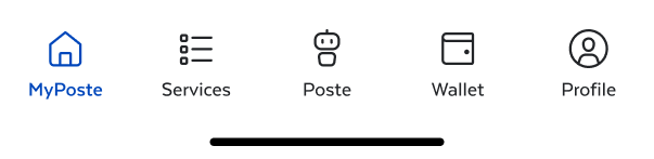
The missing spot can be now used to redirect to their assistant, "Poste", which will be later redesigned to be a reliable way to help users and manage all services.
Before
After
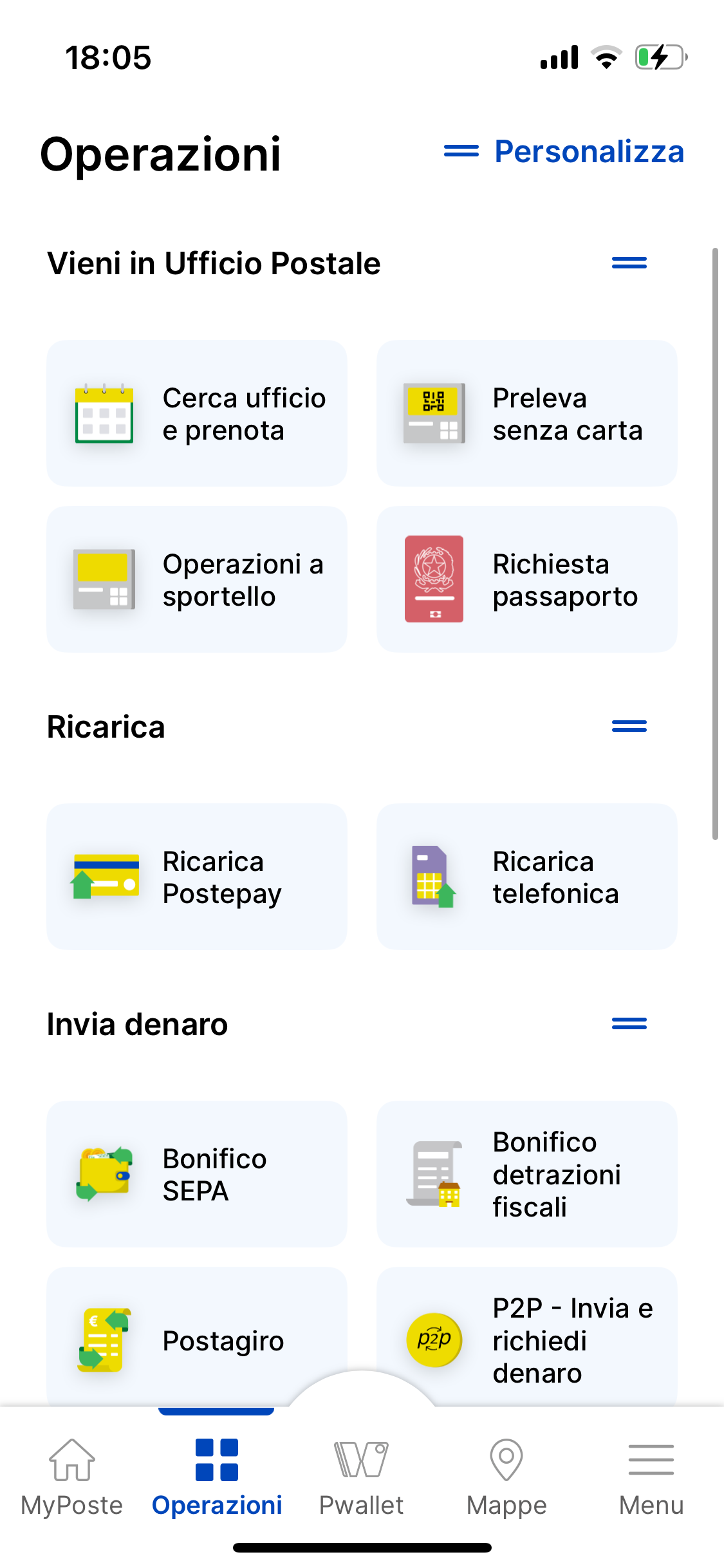
The current "Operazioni" offers a list of all available services. Nothing wrong here, however with new services being implemented and some added from the website, some categories have been added and some options have been revisited and reallocated into other options, for more clarity.
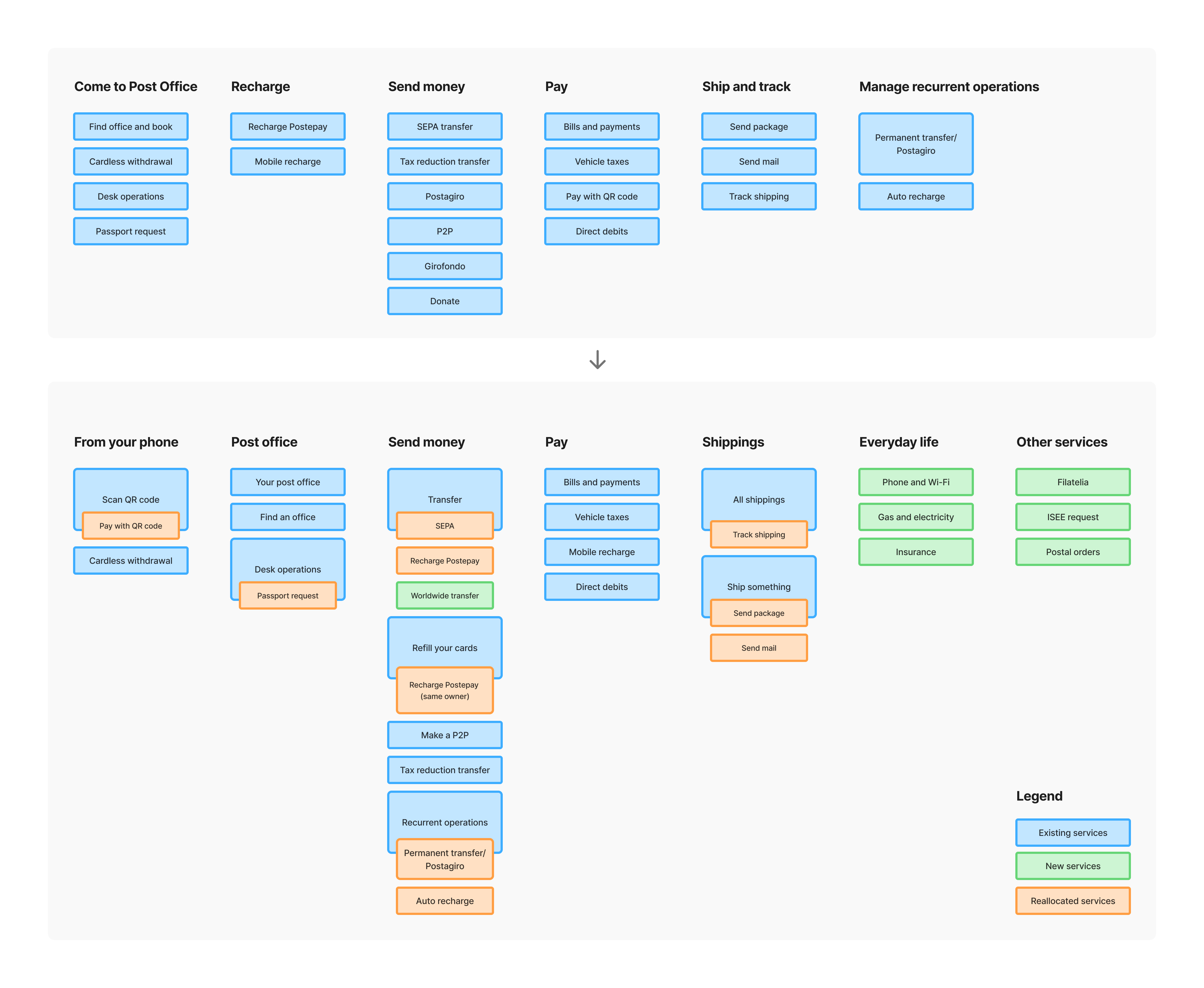
In addiction, all services are currently presented with a grid view, which increases cognitive load and doesn't allow for longer labels.
Making a list makes it easier to scan all the options and include captions under the options, for additional info.
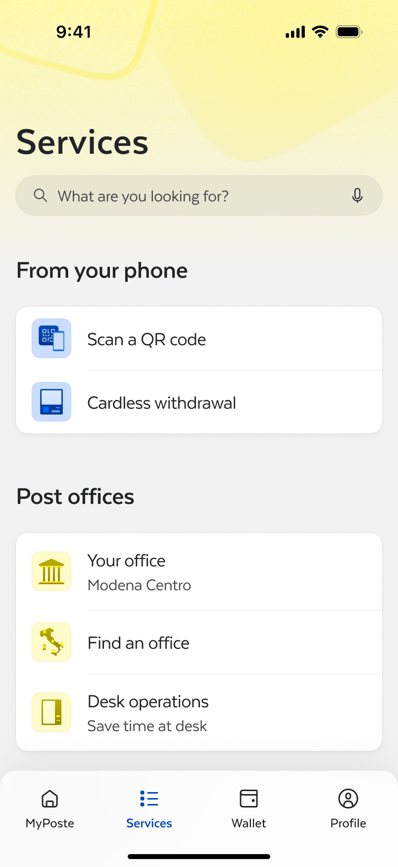
The new page is more tailored to users’ needs, and it adapt to contexts and surroundings.
The first section presents a summary of important infos from used services, such as reservations or delivery statuses, changing color based on priority.
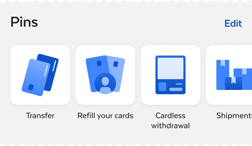
Users can pin different services for a quick access.
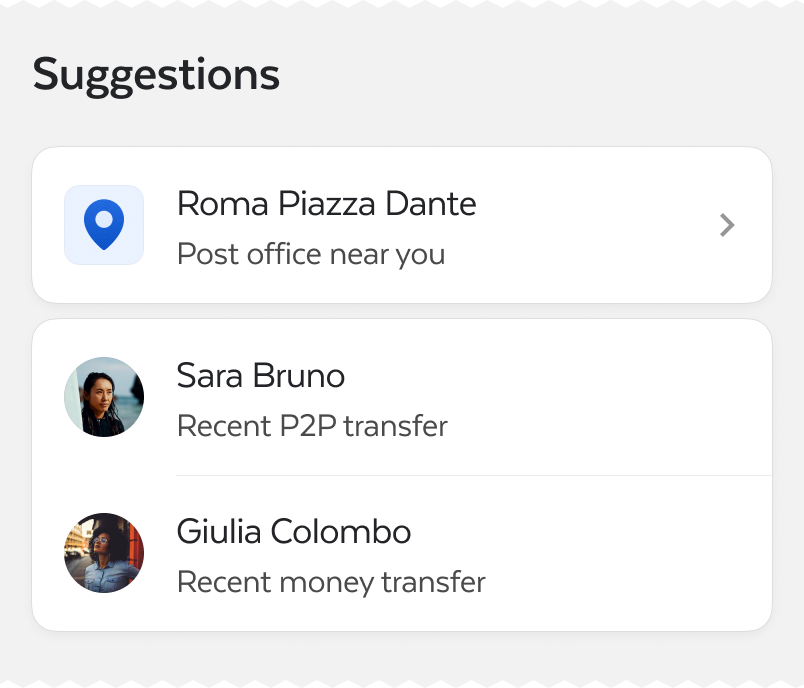
The app can give suggestions based on different things, such as contacts or location.
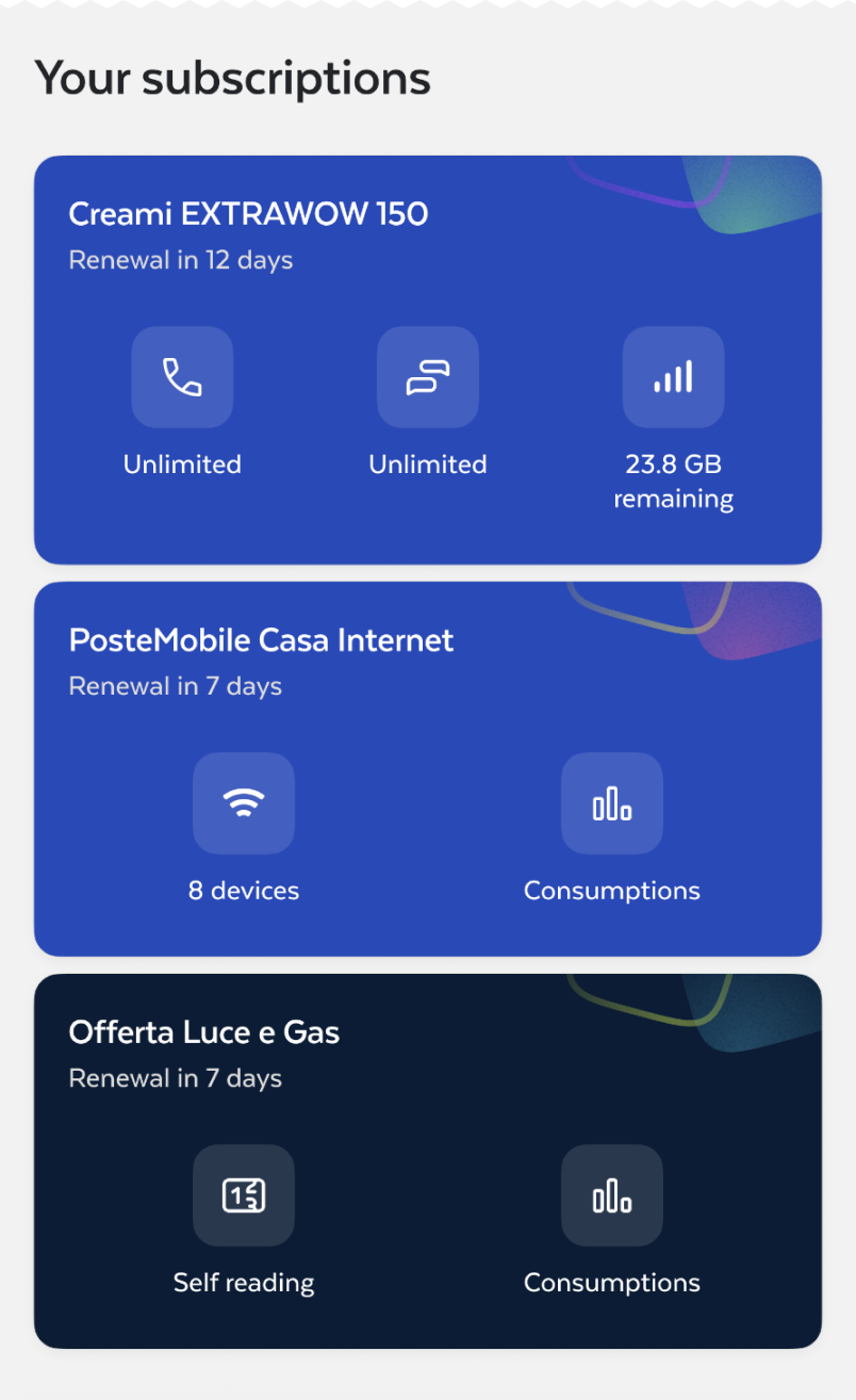
The last section includes a list of the services the user has subscribed to, with quick links and data overview.
Opening the app automatically redirects to authentication page, without any extra taps: open, authenticate and you're ready to go.
The code scanner is now fixed at the top of the page for a quick access. The scanner is universal and it adapts to every code supported by the app (PosteID, bulletins and more) and redirects the user to the service.
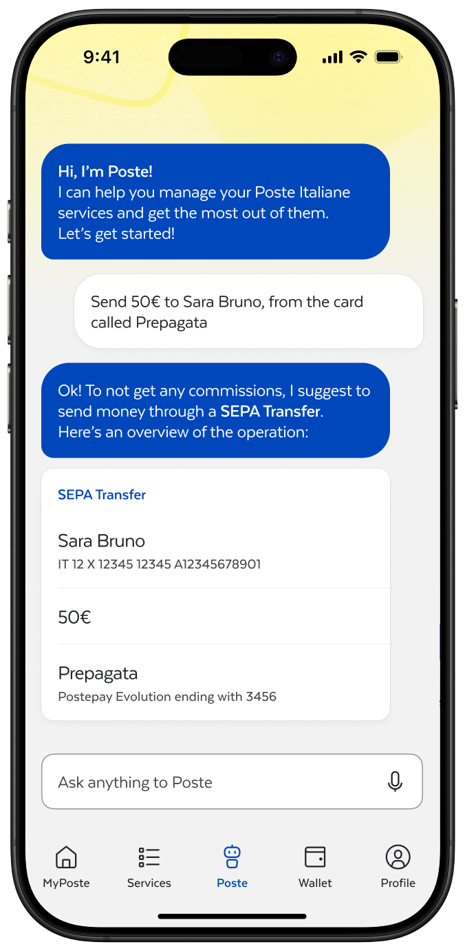
Poste is being brought from the poste.it website as a chatbot. But now, it's much more than that: is a new way to make operations and interact with Poste services.
Poste can help you with whatever thing you need: from sending money to managing your cards.
This page allows to have a better expenses management: you can choose which day the accounting month starts, and set either an overall budget for all expenses or specific amounts per category.
